INTRODUCTION
The Muvin company focuses on spending, saving and growing money smartly, for teens & young adults. Through an easy-to-use app that powers in-app, online, and in-person purchases for teens and young adults.
CHALLENGE
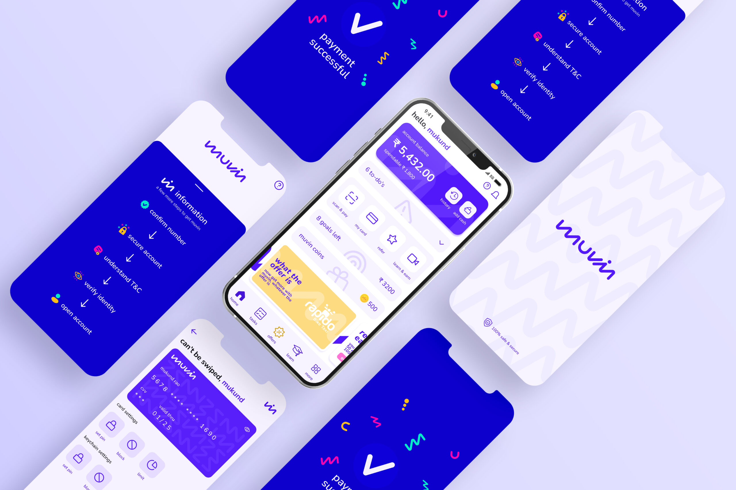
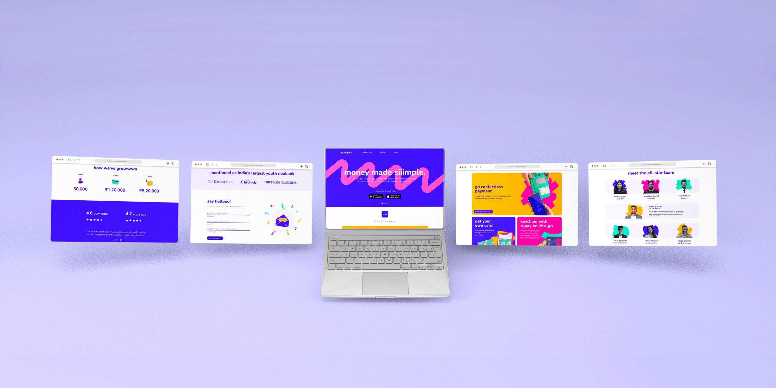
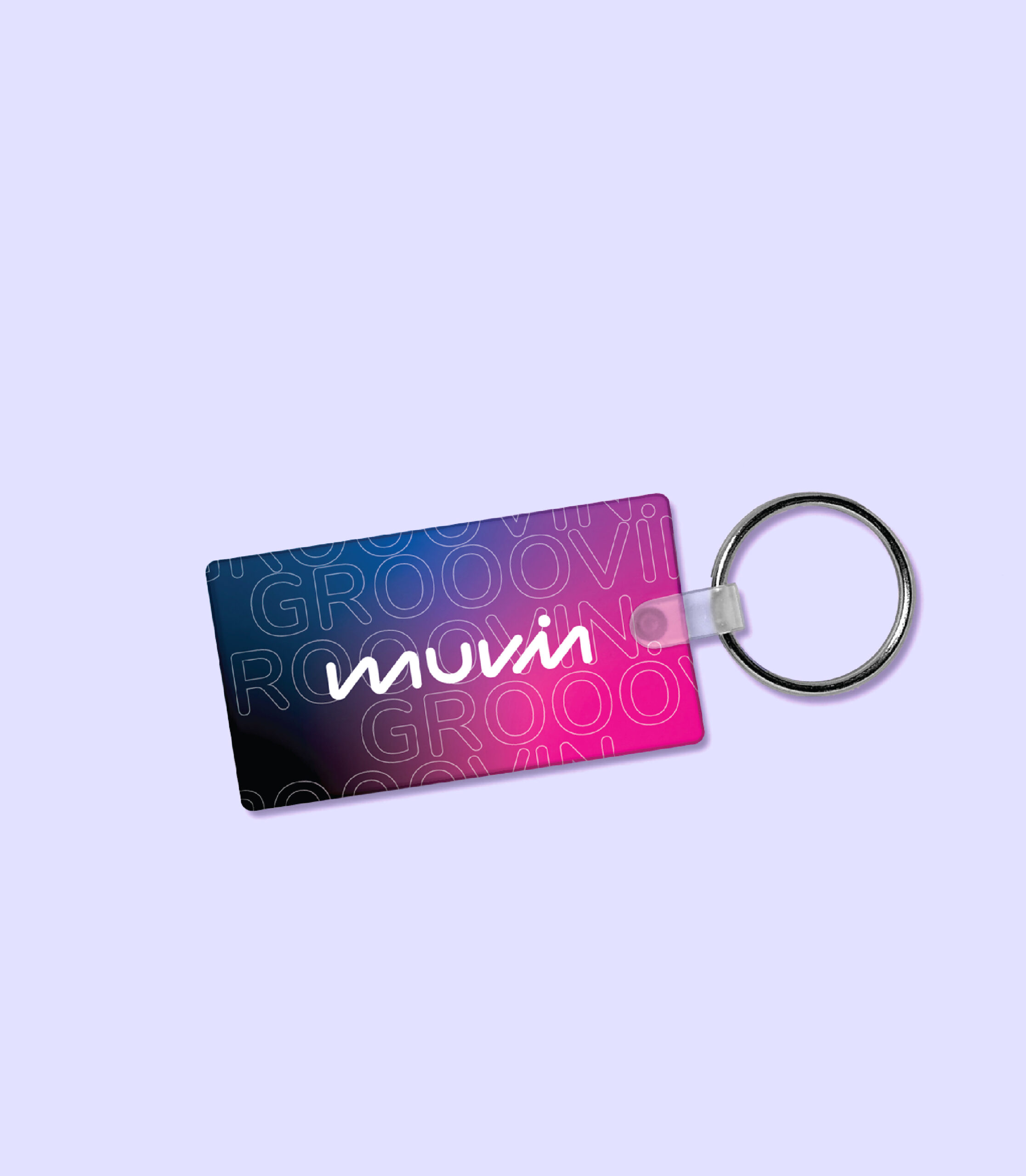
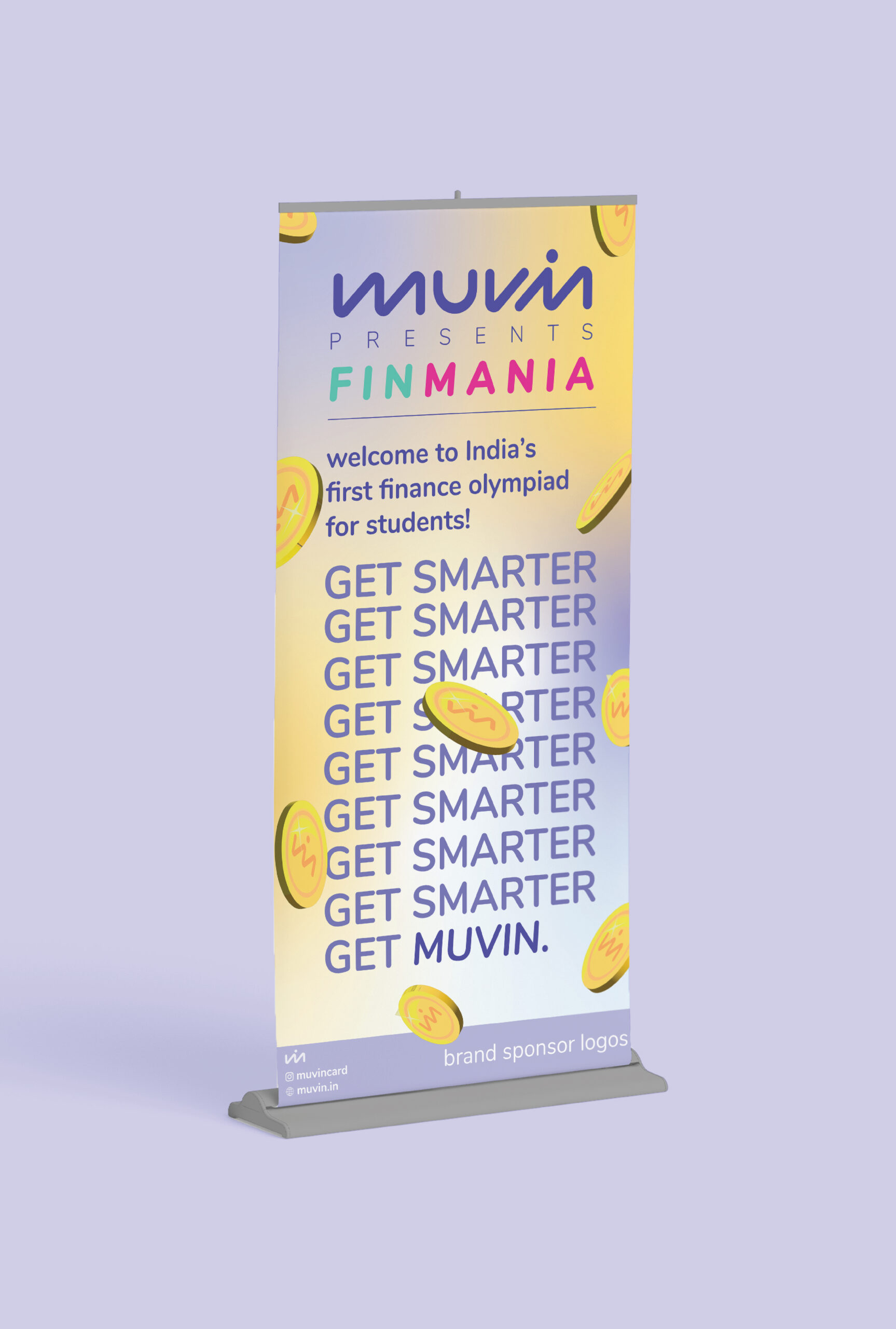
Our objective was to provide a new identity that spoke to children and young adults alike. The messaging around ‘Spending and Saving’ has been told by various banks in the most generic way possible and we had to shatter that glass ceiling. Along with creating a new Identity, we also worked on redesigning their online and offline marketing collaterals. The UI/UX of the mobile application needed to be streamlined. The website’s overall look and feel needed to change for the better. Packaging design involved re-creating the customer experience from when they unbox their new debit card to using their NFC Chip Keychain.
SOLUTION
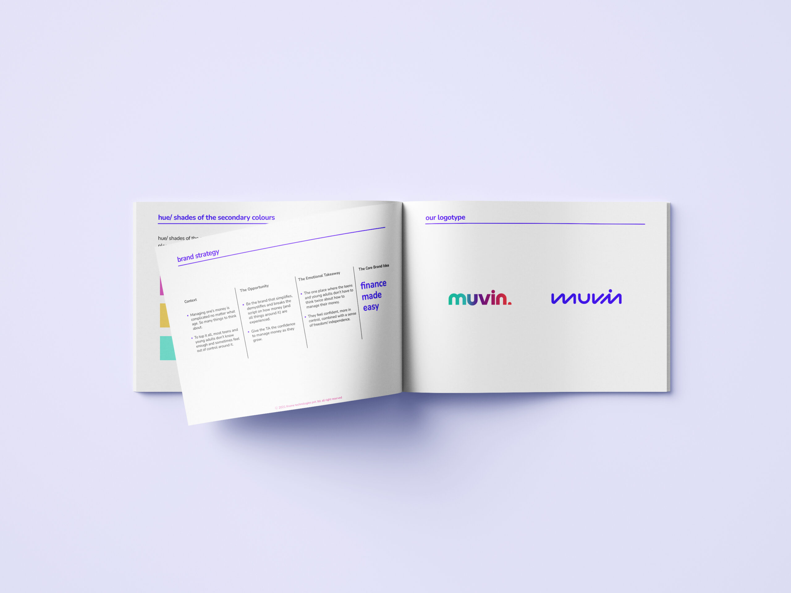
Strategically rebranding for Muvin was done for both it’s online and offline presence. The ideation revolves around the simplification of financial processes the revolves around 2 key statements based on demography,
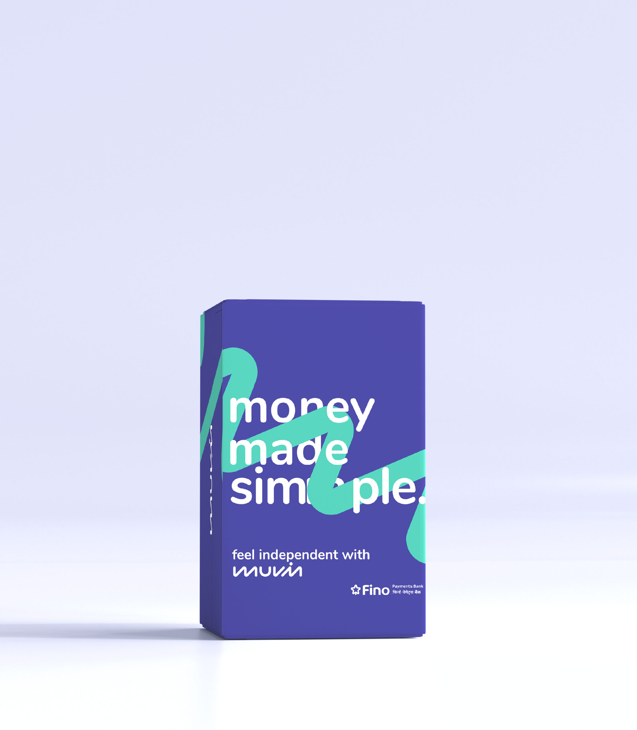
1. ‘Money made simple’ – Teenagers and Young Adults
2. ‘Finance made easy’ – Adults and Parents.
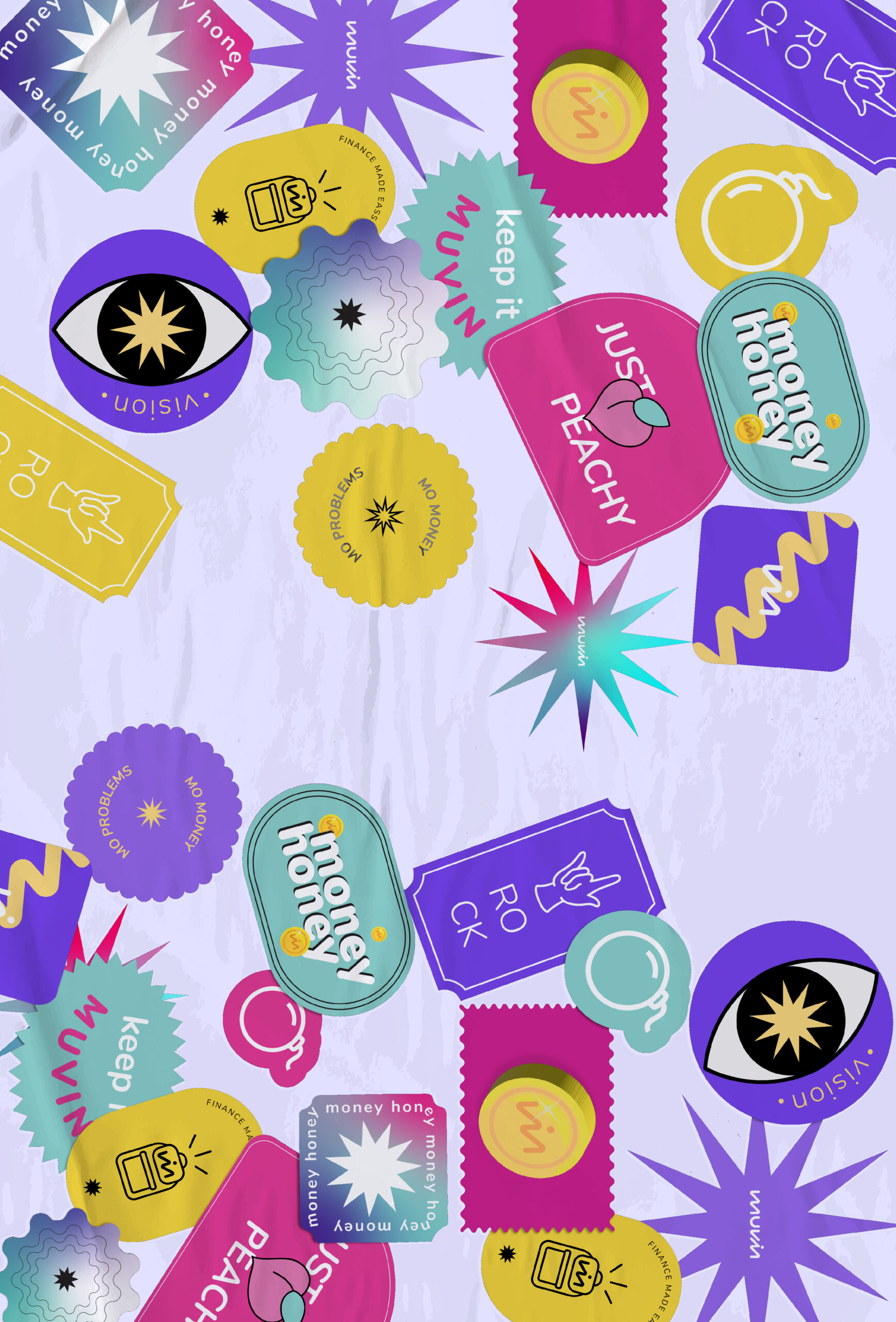
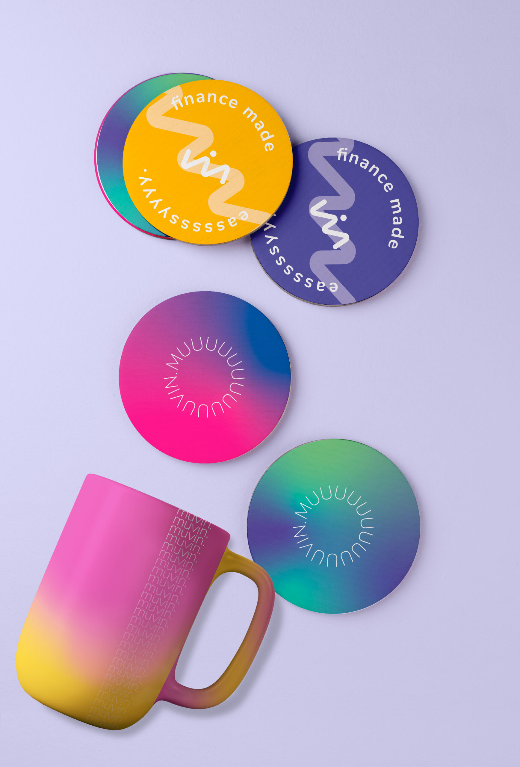
The wordmark for the logo was designed to represent a progression in finance. The forward-angled custom typography of the logo was designed to represent its fast pace and progression in finance. A clear illustration style was designed to keep communication and promotions across various social platforms consistent. The primary colour ‘murple’ along with various secondary colours were introduced to keep the messaging young and clear. The mobile application has a new direction to make it more simple and interactive, which is also carried into their Website.