OVERVIEW
Polar Bear, the ice cream destination of choice for lots of families was at the crossroads. They had just transitioned into an ice cream parlour that focused primarily on Sundaes. Thus, calling for a fresh brand identity and positioning.
RESTORE POV
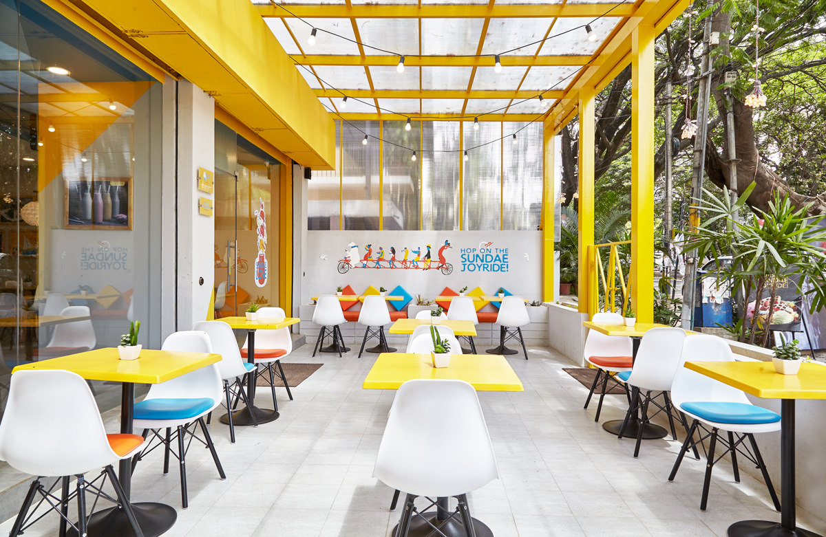
In some cases, the big idea springs directly from the product. And that was the case with Polar Bear. So the new Polar Bear store was designed with the thought of ‘Reclaiming your Sunday’. The space was inspired by the relaxed, easy atmosphere of a lovely Sunday evening spent in the company of sundaes.
DETAILS
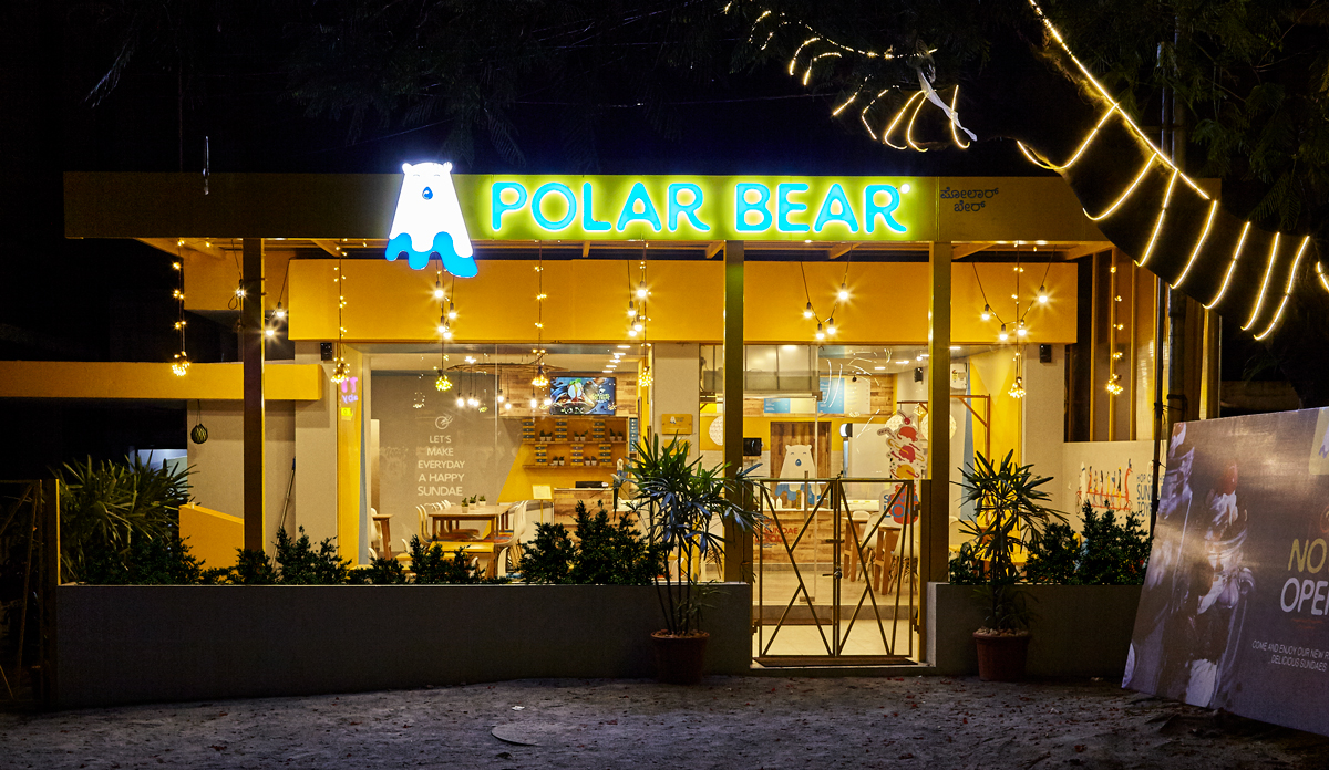
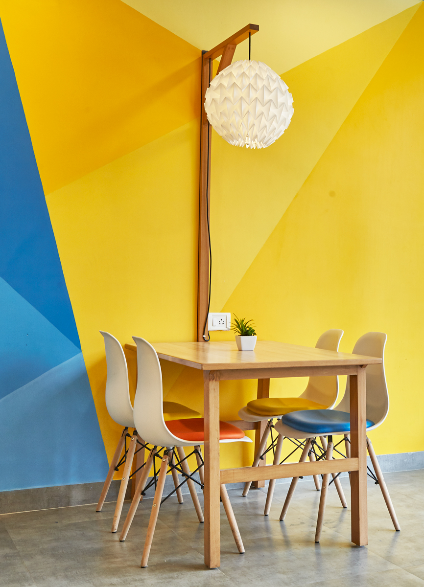
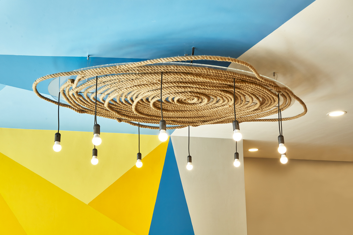
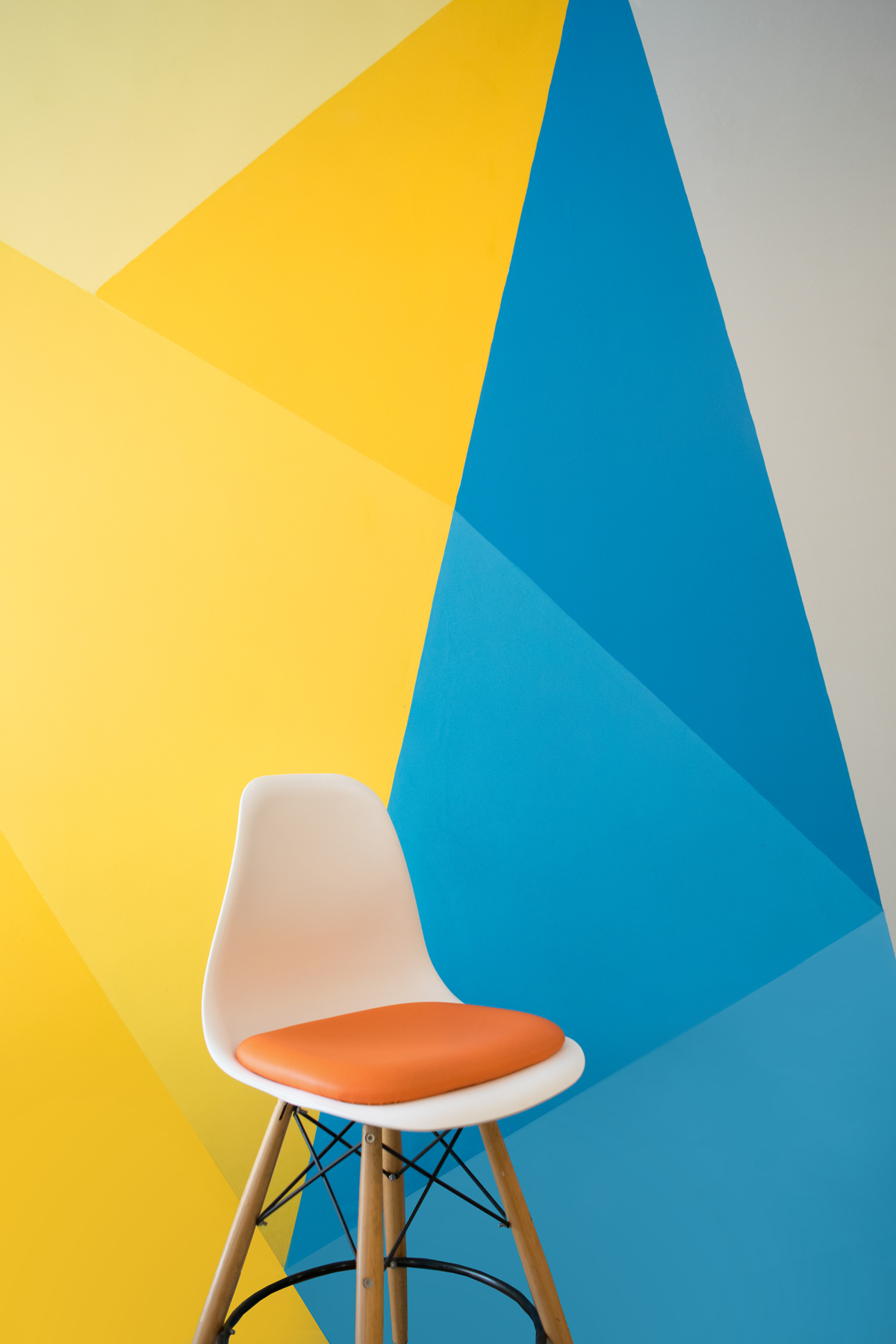
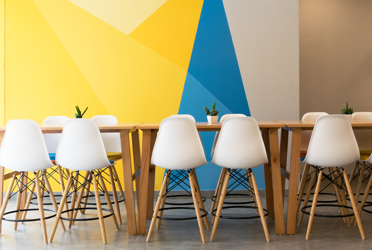
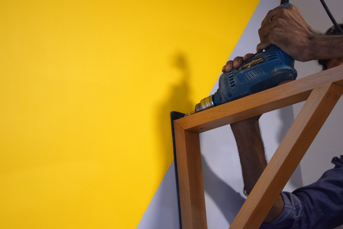
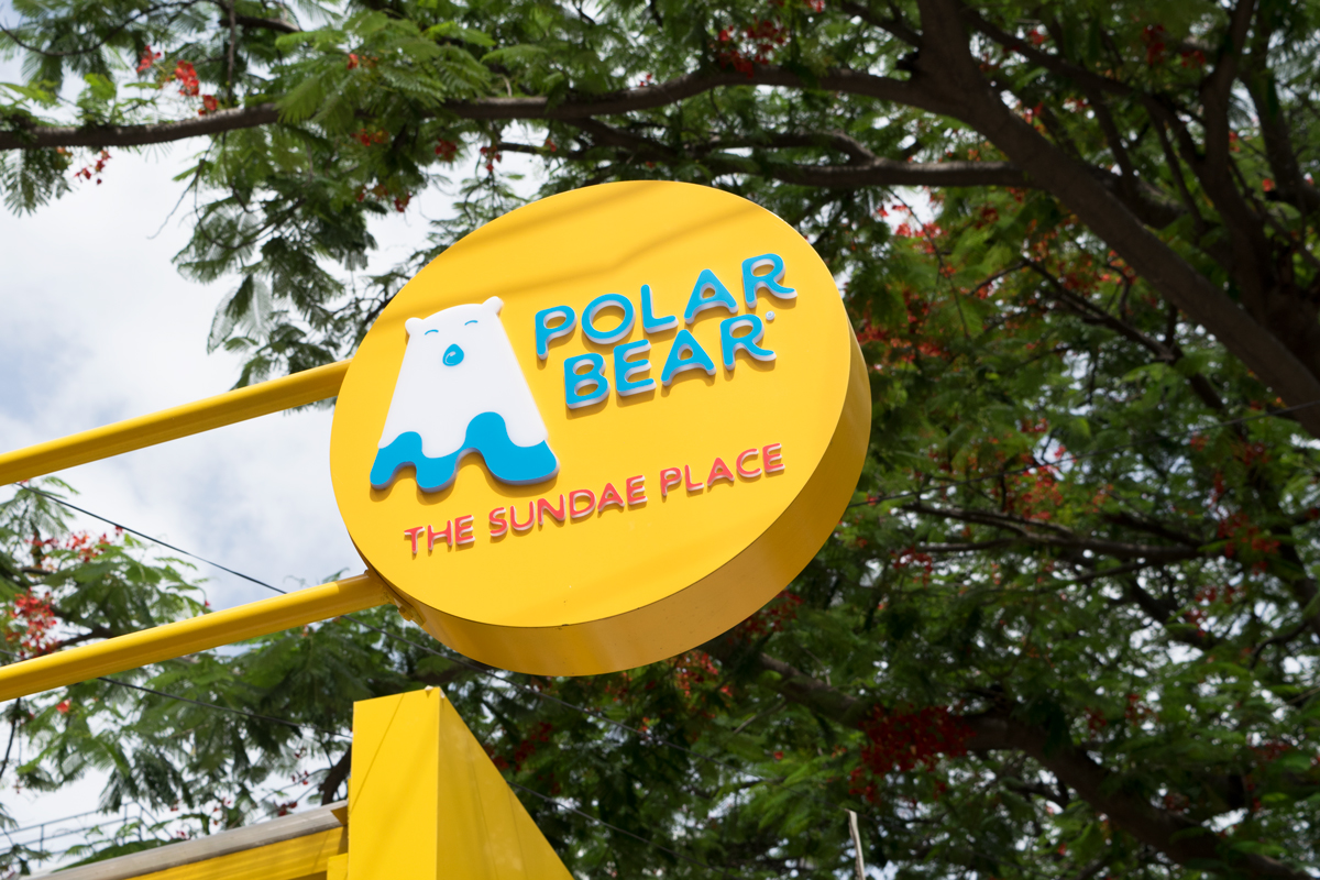
The main signage at the entrance was designed to create maximum impact. We used the brand colours to add vibrancy and a dash of freshness and youth to the parlour. The blue added a cooling touch to the space while the yellow reflects sprightly sunshine and happiness. The use of geometric lights enhanced the visual appeal of the space. We specifically designed community seating to encourage large gatherings of family and friends, creating moments of togetherness. Making Polar Bear the best place to enjoy sundaes on Sundays.